SAATVA
One of the largest (and best) online mattress companies, Saatva needed to stake their claim in the cluttered online market. Rising above the noise we positioned Saatva as the elevated and refined mattress brand that lets you “sleep above the rest”. Along with an overarching brand refresh we needed to find a cohesive way to unite the three sub brands within Saatva - Loom&Leaf, Zenhaven & Saatva Classic.
After I did a deep competitive analysis we discovered that mattress brands found themselves in blues or all bright contrasts, so we moved Saatva into a natural earthy toned color palette. Using light tones to balance the darks we created a harmonious color family with an overarching color scheme and complimentary sub brand tones. Gold signifies the elegance and craft of the hand stitched beds.
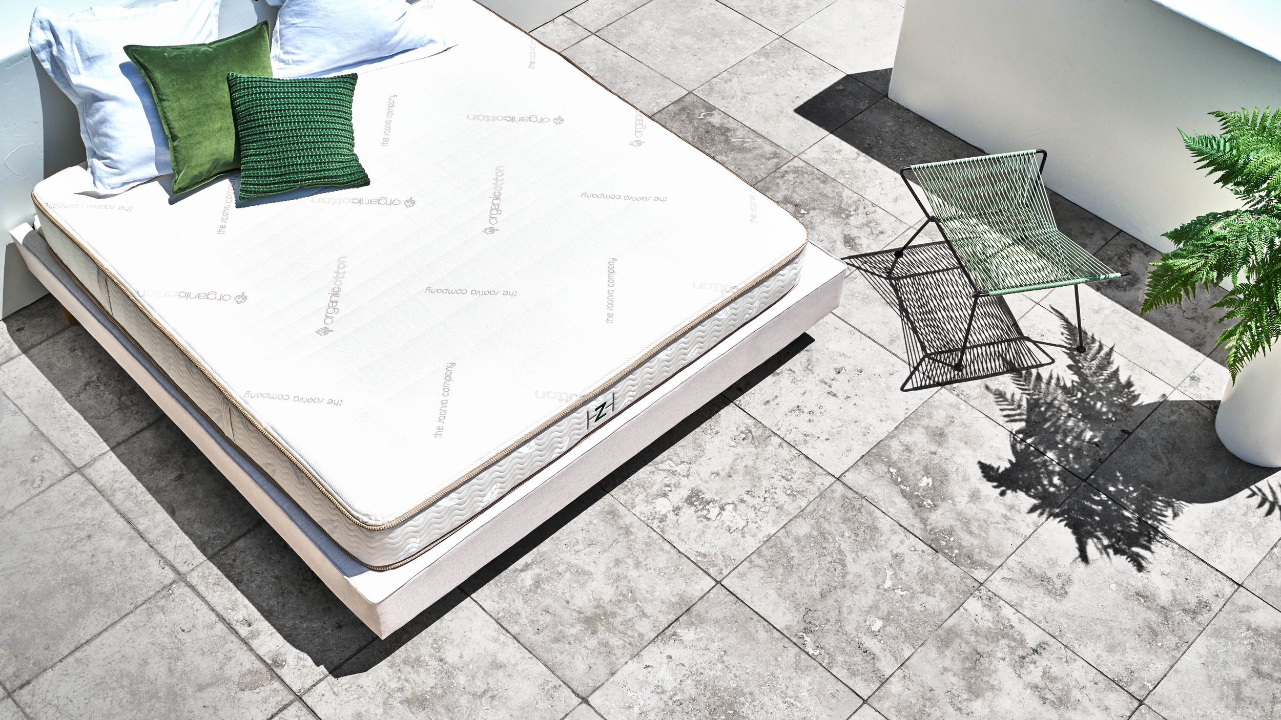
Not willing to repeat the stock image vibe of all the mattress companies on the market, we stripped back the sets and shot the mattresses at elevated angles. The world of Saatva drew on inspiration from zen gardens and modern minimal architecture. The resulting photography captures the mattresses in a totally new light and treats the beds as precious as artwork.
This whole brand refresh launched with Saatva’s first ever brand campaign “The Path To Sleep Enlightenment” which gathered over 7 million views online. The train didn’t stop there and I designed 13 landing pages that answered the most searched mattress questions with hilarious and informative FAQ videos. Working with illustrator George Greaves we created a unique series of illustrations that illuminates everything from free delivery to a person’s sleep style. Our new Saatva brand look and feel resulted in refreshed banner ads, emails and stunning print ads.
Role : Brand Strategy, UX Strategy and Design, Senior Designer,
CD : Kellyn Blount + Greg Hunter, ADC: Maxx Delaney + Nick Troop, AD+CW : Sally Franckowiak + Gabe Long


